Libra’s Favorite Color: Unlocking the Mysterious Palette
Libra individuals are known for their refined taste and appreciation for beauty, which is reflected in their favorite color palette. The mysterious nature of Libra’s favorite colors adds an air of intrigue to their personality. Shades like deep blues and purples evoke a sense of mystery and elegance that resonates with the Libra energy.
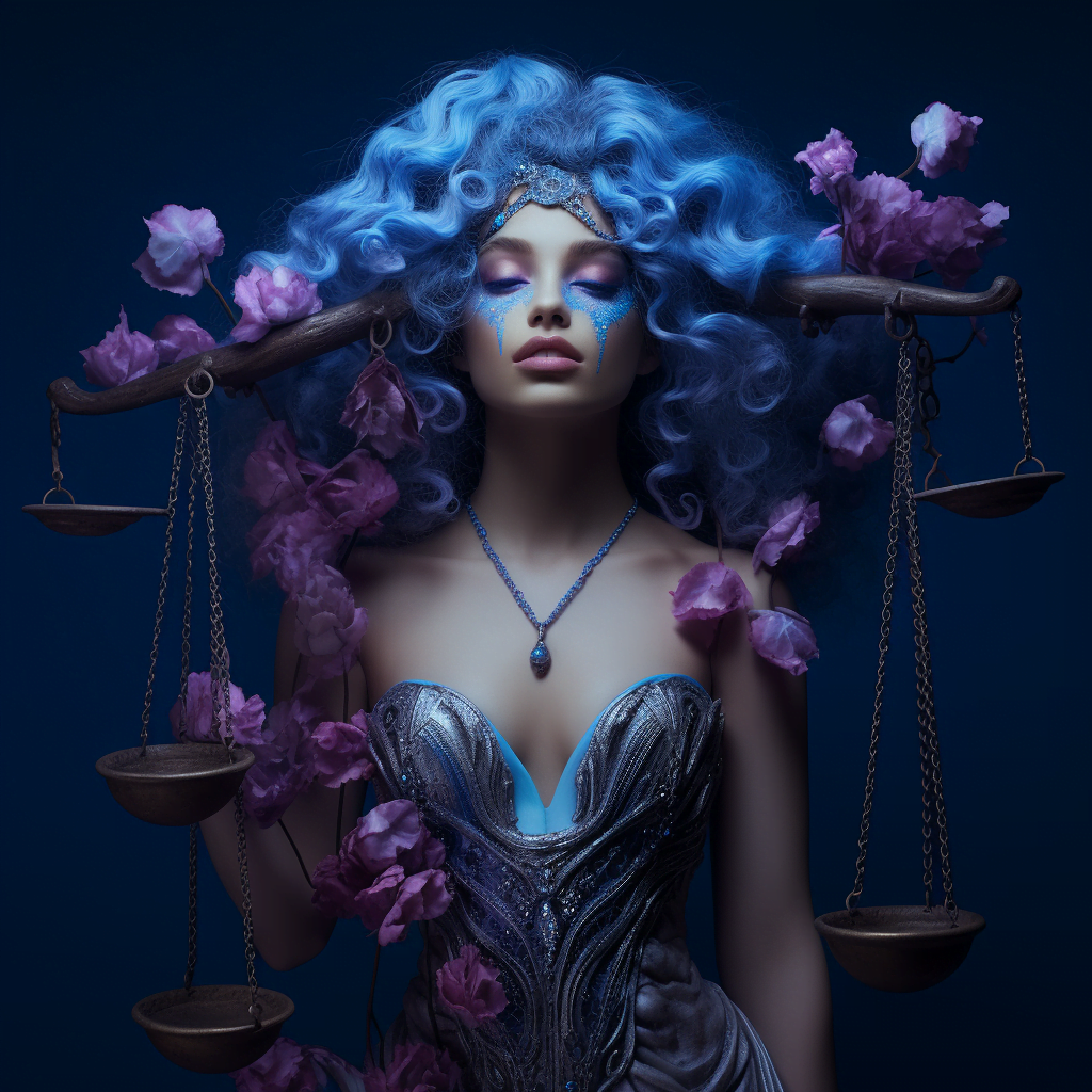
The color blue holds a special place in the heart of a Libra. It symbolizes tranquility, harmony, and balance – qualities that are highly valued by this zodiac sign. From soft pastel blues to rich navy hues, Libras find solace in the calming effect that this color brings. Blue also represents communication and intellectual stimulation, two aspects that align perfectly with Libra’s love for engaging conversations.
Another favored shade among Libras is purple. This regal hue exudes sophistication and creativity, making it an ideal choice for those born under this sign. Purple has long been associated with spirituality and intuition, both traits that resonate deeply with the introspective nature of a Libra individual. Whether it be lavender or royal purple, these shades add depth to any aspect of life where they are present.
In exploring the mysterious palette favored by Libras, it becomes evident how much thought goes into selecting colors that reflect their unique personality traits. The combination of blue’s serenity and purple’s creativity creates a harmonious blend that speaks volumes about who they are as individuals. By understanding the significance behind these colors, we can gain deeper insight into the complex world inhabited by our beloved Libras
Astrological Background: Understanding Libra’s Personality Traits
Libra, the seventh sign of the zodiac, is represented by the scales. Individuals born under this sign are known for their strong sense of justice and fairness. Libras value harmony and balance in all aspects of life, seeking to create a peaceful environment for themselves and those around them.
One key personality trait associated with Libras is their diplomatic nature. They have a natural ability to see both sides of an argument and strive to find common ground in conflicts. This makes them excellent mediators and peacemakers in personal relationships or professional settings. Libras are skilled at navigating complex social dynamics, often acting as the bridge between different groups or individuals.
Another characteristic that defines Libra’s personality is their love for beauty and aesthetics. Ruled by Venus, the planet of love and beauty, they have an innate appreciation for art, design, fashion, and all things visually pleasing. They possess a refined taste and are drawn towards elegant surroundings that evoke a sense of serenity.
With these traits in mind, it becomes clear why colors play such an important role in a Libra’s life. The right color palette can enhance their sense of balance while also reflecting their aesthetic sensibilities. In the following sections we will explore how color choices can influence emotions as well as delve into specific colors that resonate with Libra energy.
Psychological Influence: How Color Affects Human Emotions
Color has a profound psychological influence on human emotions. Different colors can evoke various feelings and moods, impacting our overall well-being and behavior. For example, warm colors like red and orange tend to stimulate energy and excitement, while cool colors such as blue and green promote calmness and relaxation.
Research suggests that color can also affect our cognitive processes. For instance, studies have shown that the color blue can enhance creativity and problem-solving abilities. On the other hand, yellow is associated with increased focus and attention to detail. Understanding these psychological influences of color can be valuable in various settings, from interior design to marketing strategies.
Moreover, cultural factors play a significant role in how we perceive different colors. Certain hues may carry specific meanings or symbolism across different societies or religions. For example, white represents purity in many Western cultures but symbolizes mourning in some Eastern cultures. Therefore, it is crucial to consider cultural context when utilizing color for emotional impact or communication purposes.
Color Symbolism: Interpreting the Meanings Behind Colors
Color symbolism plays a significant role in our lives, influencing our emotions and perceptions. Different colors evoke different feelings and convey various meanings. For example, red is often associated with passion and energy, while blue is linked to calmness and tranquility. Understanding the symbolism behind colors can help us make informed choices when it comes to expressing ourselves through color.
Yellow is commonly associated with happiness, optimism, and warmth. It symbolizes positivity and enlightenment. This vibrant color can be used to create a cheerful atmosphere in living spaces or incorporated into artwork to evoke feelings of joy.
On the other hand, green represents nature, growth, and renewal. It is often associated with harmony and balance. Green has a calming effect on the mind and body, making it an excellent choice for creating relaxing environments or incorporating into meditation spaces.
Colors such as purple are known for their association with royalty, luxury, creativity, and spirituality. Purple can add an air of sophistication to any setting or outfit while also stimulating imagination and intuition.
Understanding the meanings behind colors allows us to harness their power intentionally in various aspects of our lives – from fashion choices to interior design decisions – ultimately enhancing our overall well-being by creating harmonious environments that resonate with our personalities
Exploring Libra’s Ruling Planet: Venus and Its Color Associations
Venus, the ruling planet of Libra, holds significant influence over this zodiac sign’s color associations. Known as the planet of love and beauty, Venus is closely linked to aesthetic sensibilities and harmonious energy. In terms of color, Venus inspires Libra to gravitate towards soft pastels such as pale pink and light blue. These delicate hues reflect Libra’s desire for balance and tranquility in their surroundings.
Pink, a shade often associated with femininity and romance, resonates deeply with Libra’s gentle nature. This color embodies the loving qualities that Libras possess: compassion, empathy, and a strong appreciation for beauty. Similarly, light blue evokes feelings of calmness and serenity – characteristics that align perfectly with Libra’s quest for harmony in all aspects of life.
The connection between Venus and these colors extends beyond mere aesthetics; it also reflects the emotional depth that lies within every Libran individual. Pink represents their ability to nurture relationships while fostering understanding and cooperation among others. Light blue symbolizes their capacity for introspection and seeking inner peace amidst external chaos. By embracing these colors associated with Venus’ influence, Libras can enhance their sense of self-awareness while creating an environment conducive to personal growth without losing sight of their inherent need for equilibrium
Harmony and Balance: Colors that Resonate with Libra Energy
Libra, the sign of harmony and balance, is often associated with colors that reflect its peaceful and diplomatic nature. These colors resonate with Libra energy by promoting a sense of equilibrium and tranquility. One such color is light blue, which symbolizes serenity and calmness. Light blue has a soothing effect on the mind and can help create a harmonious environment for Libras to thrive in.
Another color that resonates with Libra energy is pale pink. This gentle hue represents love, compassion, and understanding – qualities that are highly valued by those born under this zodiac sign. Pale pink promotes emotional well-being and encourages open communication, fostering harmonious relationships both personally and professionally.
Additionally, shades of green are also favored by Libras due to their association with nature, growth, and balance. Green evokes feelings of renewal and stability while creating a sense of harmony within one’s surroundings. Whether it’s the vibrant green of fresh leaves or the calming shade of mint green, these hues provide an uplifting atmosphere for Libras to find peace in their daily lives.
By surrounding themselves with these colors that resonate with their energy, Libras can enhance their natural ability to seek balance in all aspects of life. From home décor choices to wardrobe selections or even artistic expressions through various mediums like painting or photography – incorporating these harmonious colors into different aspects of their lives allows them to tap into their true potential as diplomats who bring about peace wherever they go.
Libra’s Aesthetic Sensibilities: Complementary Colors and Contrasts
Libra individuals have a keen eye for aesthetics and are naturally drawn to complementary colors and contrasts. They appreciate the harmonious balance that these color combinations create, as it resonates with their innate sense of equilibrium. Complementary colors, such as blue and orange or red and green, enhance each other when placed side by side, creating a visually pleasing effect that Libras find captivating.
Contrasts also play a significant role in Libra’s aesthetic sensibilities. The juxtaposition of light and dark shades or warm and cool tones adds depth to their visual experiences. For instance, pairing a vibrant yellow with a deep purple can create an intriguing contrast that appeals to the artistic nature of Libras. These contrasting color choices reflect their desire for variety and stimulation in their surroundings.
Libra’s appreciation for complementary colors and contrasts extends beyond just visual aesthetics; it also influences their overall perception of harmony in life. They seek balance not only in color choices but also in relationships, environments, and experiences. By surrounding themselves with complementary colors or contrasting elements, Libras strive to achieve this desired state of equilibrium throughout all aspects of their lives.
Fashion and Style: Color Choices for Libra’s Wardrobe
Libra individuals have a keen sense of style, and their wardrobe choices reflect their love for balance and harmony. When it comes to color choices, Libras are drawn to hues that exude elegance and sophistication. One of the most favored colors for a Libra’s wardrobe is shades of blue. From light pastel blues to deep navy tones, these colors resonate with Libra’s desire for peace and tranquility.
Another color that appeals to the fashion-forward Libra is pink. Soft blush pinks or dusty rose shades are often seen in their closet as they symbolize romance and femininity. Pink also represents compassion and understanding, qualities that align well with the diplomatic nature of a Libra.
Additionally, earthy tones such as beige, taupe, or olive green are popular among Libras who appreciate natural beauty. These colors evoke a sense of grounding and stability while still maintaining an element of refinement. Whether it’s a cozy sweater or tailored trousers, these earthy hues add warmth and versatility to any outfit.
Incorporating these preferred colors into their wardrobe allows Libras to express themselves authentically while radiating gracefulness in every ensemble they wear. By carefully selecting garments in shades like blue, pink, or earthy tones like beige or olive green, they can create outfits that not only showcase their personal style but also enhance their innate charm and elegance without overpowering it
Décor and Design: Creating Harmonious Spaces for Libra
When it comes to decorating spaces for Libra, creating a harmonious environment is key. Libras are known for their appreciation of beauty and balance, so incorporating these elements into their décor is essential. One way to achieve this is by using a color palette that promotes tranquility and harmony. Soft pastel shades like pale blue, lavender, and pink can create a calming atmosphere in any room. These colors also reflect the gentle nature of Libras and help promote relaxation.
In addition to choosing the right colors, it’s important to consider the overall layout and arrangement of furniture in a space dedicated to Libra. Symmetry plays an important role in achieving balance, so arranging furniture in pairs or mirrored positions can be visually appealing to Libras. Incorporating round shapes or curved lines can also add a sense of flow and softness to the space.
Another aspect that should not be overlooked when designing for Libra is lighting. Natural light is highly valued by this sign as it brings out the true beauty of their surroundings. Large windows or skylights are ideal for allowing ample natural light into the room during daytime hours. When artificial lighting is necessary, opt for soft ambient lights rather than harsh overhead fixtures.
By paying attention to color choices, symmetry in design layout, and appropriate lighting options, you can create harmonious spaces that resonate with Libra energy. Whether it’s a living room filled with relaxing pastels or an office space designed with balanced symmetry, these considerations will ensure that your décor reflects the aesthetic sensibilities of this air sign while promoting peace and serenity within their environment
Artistic Expression: Colors that Inspire Libra’s Creative Side
Libra individuals possess a strong sense of aesthetic appreciation and are often drawn to colors that inspire their creative side. One color that resonates deeply with Libras is blue. Symbolizing tranquility, harmony, and balance, blue evokes a sense of calmness and serenity within the artistic endeavors of Libra. Whether it’s painting, photography, or any other form of artistic expression, incorporating shades of blue can ignite the imaginative spark within them.
Another color that sparks creativity in Libras is green. As the color associated with nature and growth, green represents renewal and rejuvenation. It inspires Libras to explore new ideas and experiment with different techniques in their artistry. Incorporating various shades of green into their work can stimulate innovative thinking and help Libras tap into their boundless imagination.
Additionally, purple holds a special allure for those born under the sign of Libra when it comes to artistic expression. This regal hue symbolizes luxury, spirituality, and creativity – all qualities that resonate strongly with this zodiac sign. Purple stimulates introspection and encourages deep reflection on emotions and experiences as they translate them onto canvas or through other forms of creative output.
The combination of these inspiring colors – blue for tranquility, green for growth, and purple for spirituality – creates an ideal palette for Libras seeking to express themselves artistically. By incorporating these hues into their artwork or surrounding themselves with these colors during moments of inspiration or reflection; they can unlock new depths within their creative process without limitations or boundaries